
The Problem
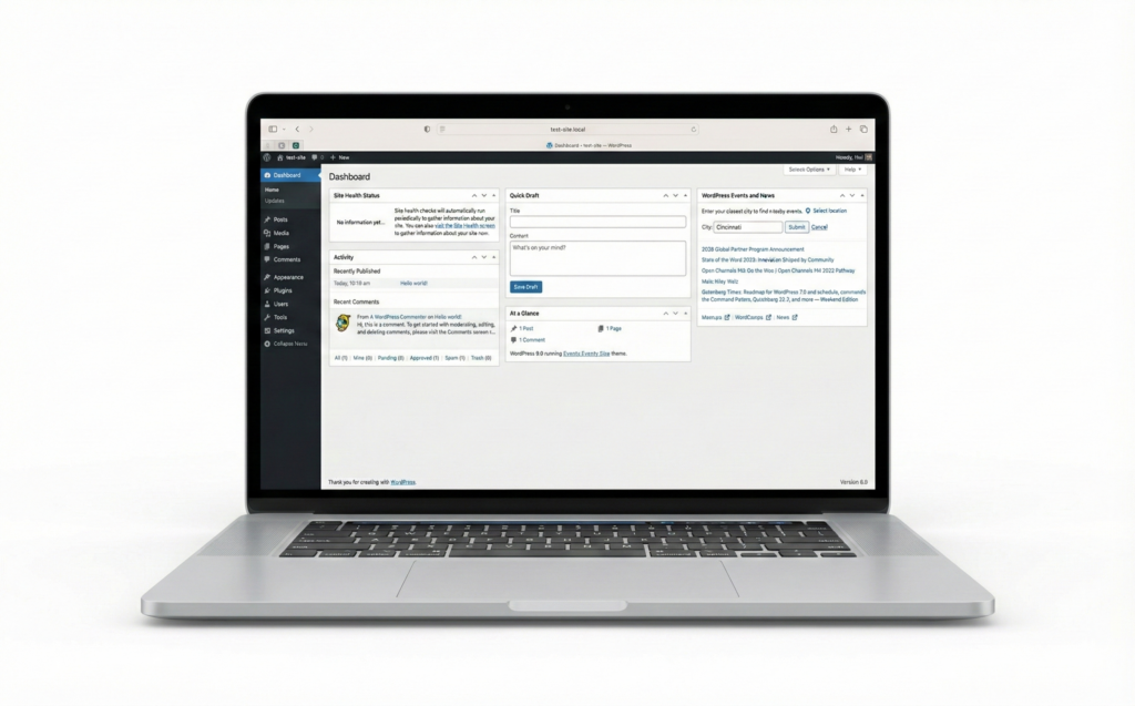
Everyone’s tired of looking at WordPress’s outdated admin interface, that’s why people are switching to other website builders and CMS systems. Don’t get me wrong—WordPress is a powerful and relatively cheap solution (if you know what they are doing), but while most of my clients are still comfortable using it vanilla but let’s be honest: the dashboard hasn’t aged well. As a UI/UX designer, I found myself wishing it felt more like Squarespace or other modern platforms with clean, minimal interfaces.
Before building my own solution, I tried the popular UI enhancement plugins—UIXpress and UIpress. They seemed promising at first, but both had serious issues:
- Layout breaking: They frequently broke the layout of various admin pages especially with their dark mode features.
- FOUC (Flash of Unstyled Content): That annoying flicker where you see the default WordPress UI before the custom styles load.
- Over-engineered: Too many features I didn’t need, which added bloat and complexity
I needed something lightweight, reliable, and purpose-built for mine and my clients’ use case.
Enter Claude Code
Instead of settling for broken plugins or learning to live with WordPress’s default interface, I decided to build my own custom mu-plugin using Claude Code. For those unfamiliar, mu-plugins (must-use plugins) are WordPress plugins that load automatically and can’t be deactivated—perfect for site-critical functionality like UI customization.
The Development Process
Working with Claude Code was surprisingly straightforward. I started by explaining what I wanted: a clean, flat design with a white color scheme that felt modern and professional. No shadows, no dark mode, no unnecessary visual clutter.
I told Claude to re-design the WP admin dashboard with the following design changes
- A completely flat design aesthetic with the default color theme picker disabled.
- White backgrounds throughout with subtle rounded borders on card, table and button elements.
- A wider sidebar (240px) with the client’s site logo at the top
- Clean top admin bar on both frontend and backend with a logo
- Consistent typography and spacing
- A customisable logo in the sidebar to make it white-label
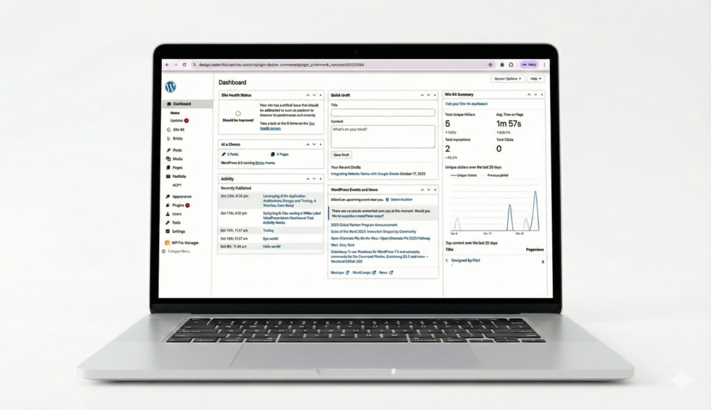
The Result
Now the WordPress admin feels like a modern web application for my clients to use. The interface is clean, consistent and blends in very well with the Gutenberg editor. More importantly, it doesn’t break like other admin customiser plugins.
The best part? Because it’s a custom solution built specifically for my needs, I’m not dealing with bloated settings pages, feature creep, or compatibility issues from trying to serve every possible use case.
Why This Matters
If you’re running a professional WordPress site and find yourself avoiding the admin dashboard because it feels dated, you don’t have to settle. With tools like Claude Code, building custom solutions for your clients is more accessible than ever—even if you’re not a PHP expert. This is a simple project that took me a few prompts and less than a couple of hours to make. It is a proof of concept that redesigning the WordPress admin dashboard is possible and that AI can be used in WordPress development.
The WordPress admin doesn’t have to look like it’s from 2010. Sometimes the best solution isn’t finding the perfect plugin—it’s building exactly what you need with Claude.