The Challenge
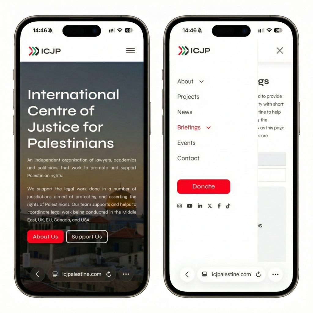
When the International Centre of Justice for Palestinians (ICJP) approached us to migrate their website from Elementor, the brief was clear but loaded with complexity: rebuild the entire site on Bricks Builder while maintaining functionality and improving the chaotic backend architecture. The catalyst? Elementor’s ownership raised ethical concerns for an organization focused on Palestinian legal advocacy.
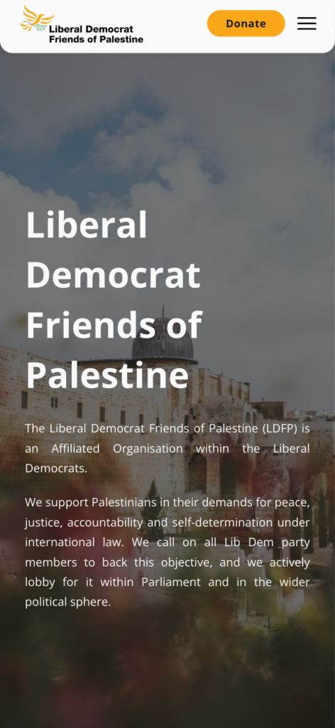
Shortly after, Liberal Democrat Friends of Palestine (LDFP) came to us with a site that was, to put it diplomatically, FUBAR—particularly on the admin side. Different clients, different missions (legal vs. political advocacy), different brand identities. But the underlying need was identical: a robust, maintainable WordPress ecosystem that could scale with their growing advocacy work.
The opportunity was obvious: why not build both with the same design language?


Design System Architecture
We pitched a unified design system that would respect each organization’s distinct brand identity while sharing structural DNA. Taking inspiration from Apple’s Newsroom—with its clean card-based layouts and generous whitespace—we built a component library in Figma centered around flexibility and consistency.
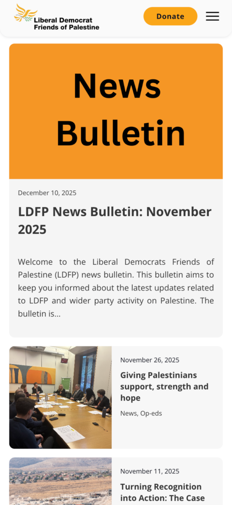
The Card System: Both sites use a uniform card module with consistent padding and subtle rounded corners applied universally across all elements—cards, buttons, images, form inputs. The news grids display in a 3-column layout on desktop (collapsing to single-column on mobile), with each card containing a featured image, date stamp, headline, and excerpt. The genius is in what’s different: LDFP alternates photo cards with solid orange “News Bulletin” cards, creating visual rhythm and breaking up the monotony. ICJP keeps it straight documentary—every card features imagery because their work is evidence-based and visual proof matters.
Color Strategy: Each organization came with established brand colors—ICJP’s crimson red and LDFP’s vibrant orange. My role was building the supporting palette around these anchors. I chose neutral grays (#333 for body text, #666 for secondary text, #F5F5F5 for subtle backgrounds) that would work harmoniously with both brand colors while maintaining WCAG AA accessibility standards. White space became a color in itself—vast expanses of it creating breathing room and directing focus. For interactive states, I implemented subtle hover darkening on the primary brand colors (roughly 10% darker) and clean white-on-brand-color button treatments that reverse on hover. This restrained palette keeps attention on content and imagery rather than competing with visual noise.
Rounded Corners Throughout: Every element—cards, buttons, images, form fields, even the navigation elements—features consistent border-radius values. This softens the interface, making it feel approachable rather than corporate-sterile, while maintaining the professional credibility these advocacy organizations require.
Spacing System: All spacing follows a strict multiple-of-8 system—padding, margins, gaps, and any numeric value adheres to this grid (8px, 16px, 24px, 32px, and so on). This mathematical consistency creates visual rhythm across both sites and ensures the layout remains harmonious regardless of viewport size. It’s the invisible skeleton that makes everything feel intentionally placed rather than arbitrary.
The Alternating Content Pattern: Both sites use asymmetric two-column layouts throughout (approximately 60/40 split). Text on the left, supporting image on the right—then it flips. This creates visual interest as users scroll while maintaining readability. The pattern repeats in “What We Stand For,” “What We Do,” and project sections. It’s predictable enough to feel coherent but varied enough to avoid monotony.
Typography Hierarchy: We established a major third ratio typographic scale that creates clear visual hierarchy from body copy through subheadings to hero headlines. The scale remains consistent across both sites, ensuring readability across devices while each brand uses its own typeface to maintain distinct personality.
Hero Treatment: Full-width hero sections with dark gradient overlays ensure white text remains legible over varied imagery. Each hero contains a mission statement and dual CTAs—one primary (filled with brand color), one secondary (outlined). This button pairing repeats throughout both sites, training users on interaction patterns.
Navigation Architecture: Clean horizontal nav bars with logos positioned left, links center-aligned, and primary CTAs (Donate buttons) fixed right. Social icons integrate directly into the nav. Both implementations use sticky navigation across all devices—desktop, tablet, mobile—maintaining persistent wayfinding. On mobile, the nav collapses into a hamburger menu with the same logical organization.
Technical Implementation
Built entirely on Bricks Builder, we architected proper content management using Advanced Custom Post Types (ACPT). We created dedicated post types for news articles, events, projects, team members, and portfolio items—each with custom fields and taxonomies. This solved the backend chaos both organizations were drowning in.
Every form connects directly to Google Sheets via custom webhooks. Both sites feature fully functional donation systems integrated seamlessly into the design. To elevate UX beyond static page loads, we implemented view transitions using WordPress Performance Labs’ experimental features—smooth, app-like navigation that makes browsing feel fluid.
Responsive Execution


Built mobile-first, accounting for every device type. Card grids reflow from three columns to single-stack. Hero typography scales proportionally. Donation forms remain thumb-friendly. Navigation stays sticky but adapts. Every interaction was tested across breakpoints.
Results
Two organizations with distinct missions now have websites that feel professionally related but appropriately different—like siblings, not twins. The shared design language reduced development time, maintained code quality, and created a foundation both clients can build on. The backend tells the success story: clean post types, organized taxonomies, logical content architecture.
The organizations’ teams can now manage content confidently without touching code—exactly what a CMS should enable.
