When we set out to build YeahApp—a community and event management social platform—we faced the classic startup dilemma: move fast or build well. We chose both. Our secret? A solid boilerplate foundation, flow-first UX design, and a hybrid role that merged design with quality assurance—all accelerated by Claude as our AI testing partner.
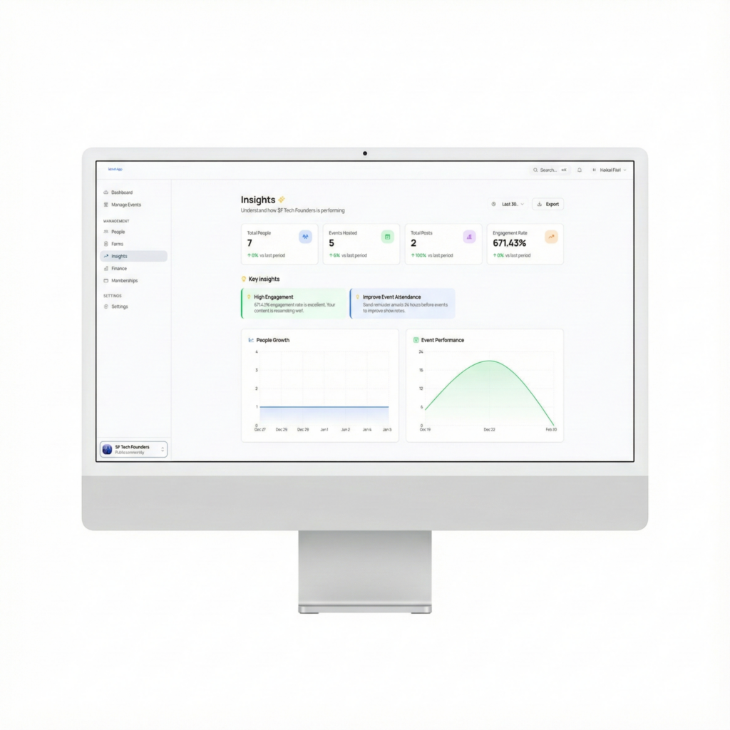
The Foundation: Don’t Reinvent the Wheel
We started with the ZTS boilerplate, a pre-configured Next.js starter that gave us authentication, database connections, and a component library out of the box. Instead of spending the first month on infrastructure, we spent it on the product.
The boilerplate also gave us shadcn/ui—a design system philosophy where every button, card, and form input follows consistent patterns. We customized the colors based on the given branding kit done by the graphic designers, integrated the shadcn UI design accordingly, and suddenly everything we built looked like it belonged together.
This wasn’t about cutting corners. It was about starting from a higher floor so we could reach a higher ceiling.
Designing the Experience, Not Just the Screens
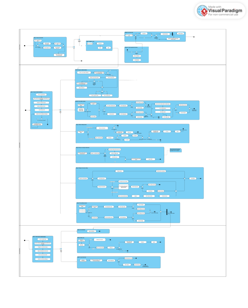
My approach to UI/UX was different from traditional design workflows. Because of time constraints, instead of starting in Figma with pixel-perfect mockups, I decided to combine AI-assisted design, Agile workflow, and model-driven engineering approaches to meet deadlines. I started with UML activity diagrams—flowcharts that map out every decision point in a user journey.
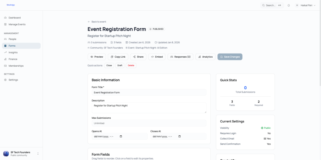
For instance, before we built the event registration feature, I mapped out the logic in Visual Paradigm online: What if the user isn’t logged in? What if the event requires a form? What if it’s a paid event but the organizer hasn’t set up payments yet? Each branch led somewhere different, and the diagram made those paths visible before any code existed.
This caught problems early. We discovered that private community invitations needed to check for registration forms before granting membership—not after. Without the diagram, that edge case would have become a bug report three weeks later.
The visuals came second. Once the flow was solid, the screens almost designed themselves. A loading state here, a success message there, an error screen for that edge case we already anticipated.
The Hybrid Role: Designer Who Tests, Tester Who Designed
Here’s where things got interesting. Instead of the traditional handoff—designer creates mockups, developer builds, QA tests—I combined the design and QA roles into one continuous loop.
I’d design a flow with UML, watch it get implemented, then immediately test it myself. Not just “does the button look right?” but “does this flow actually work the way I designed it?”
This hybrid approach caught issues that slip through traditional processes:
- A designer who doesn’t test might not notice the implementation diverged from the design
- A QA tester who didn’t design the flow might not recognize when logic is subtly wrong
- By doing both, I caught the gaps between intention and reality
When I found a bug, I didn’t just say “this is broken.” I could explain why it was broken relative to the intended experience with the help of AI and my relatively decent understanding of Nextjs frontend code.
Claude as the QA Accelerator
This is where Claude changed everything. I’m not a full-stack developer. I can read and comprehend frontend code and understand the architecture of most systems, but I can’t debug a complex backend. So when I found a flow problem, I’d describe it to Claude in plain English: “When users accept an invite to a private community that has a registration form, they’re skipping the form and going straight to the community page.”
Claude would dive into the codebase, find the exact function causing the issue, and explain in simple terms: “The invitation acceptance creates the membership immediately, before checking if there’s a form to fill out. By the time the redirect happens, they’re already a full member.” Claude then generates a concise report of the issue, pinpointing to the exact location of the issue which I double check to make sure it is right and makes sense.
Thus, I could file bug reports that developers actually wanted to read. Not vague complaints, but specific issues with root causes and suggested fixes. The feedback loop tightened from days to minutes.
The Results
YeahApp shipped with the kind of polish that usually takes much longer to achieve. Error messages explain what went wrong. Edge cases are handled gracefully instead of crashing mysteriously.
More importantly, we built a sustainable process:
- Flow-first design means fewer surprises during implementation
- Hybrid designer-QA role means faster feedback loops
- AI-assisted testing means non-developers can contribute meaningful technical feedback
With such processes there was better alignment between business and technical teams. There was less confusion when a feature addition is suggested.
The Social Platform Design
The idea and inspiration was to build something simple where users can discover communities and events easily. Users can keep track of what’s happening in the communities they joined through community discussions and posts.
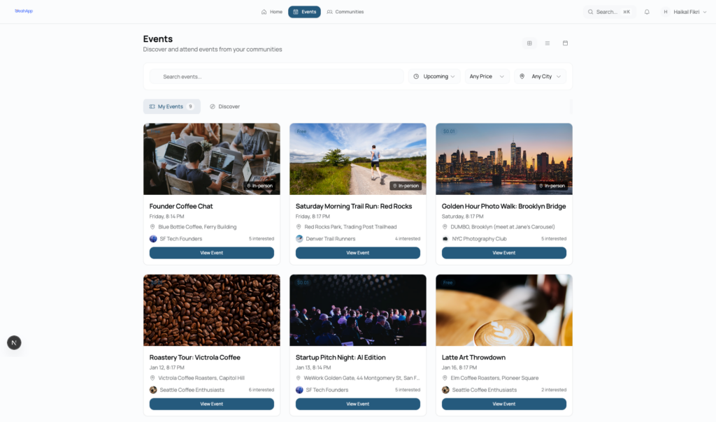
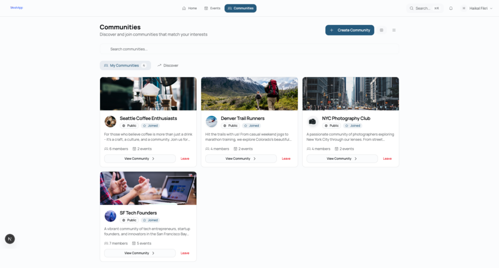
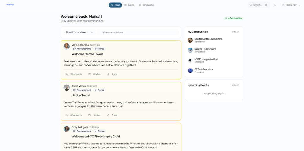
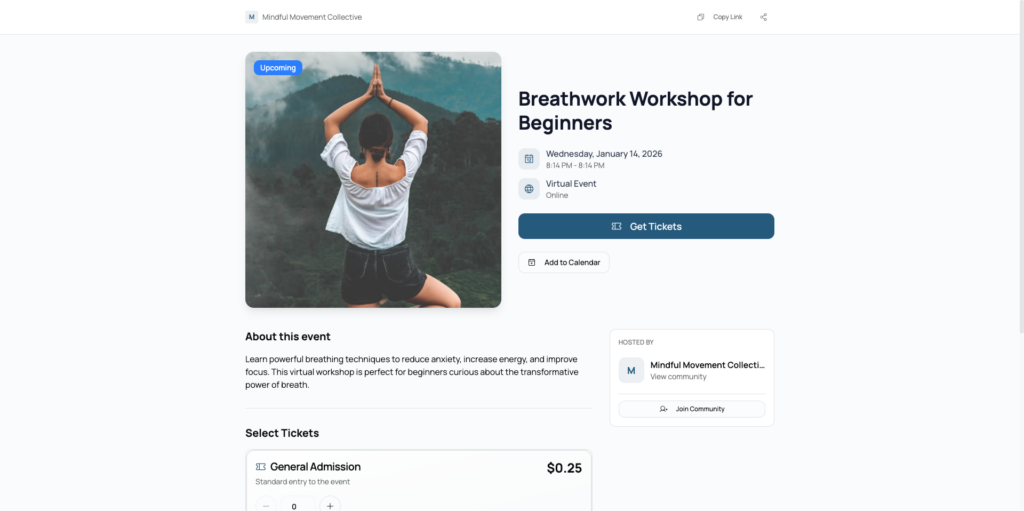
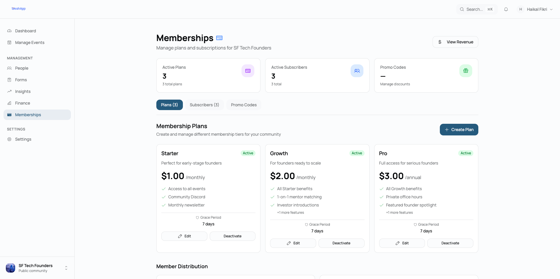
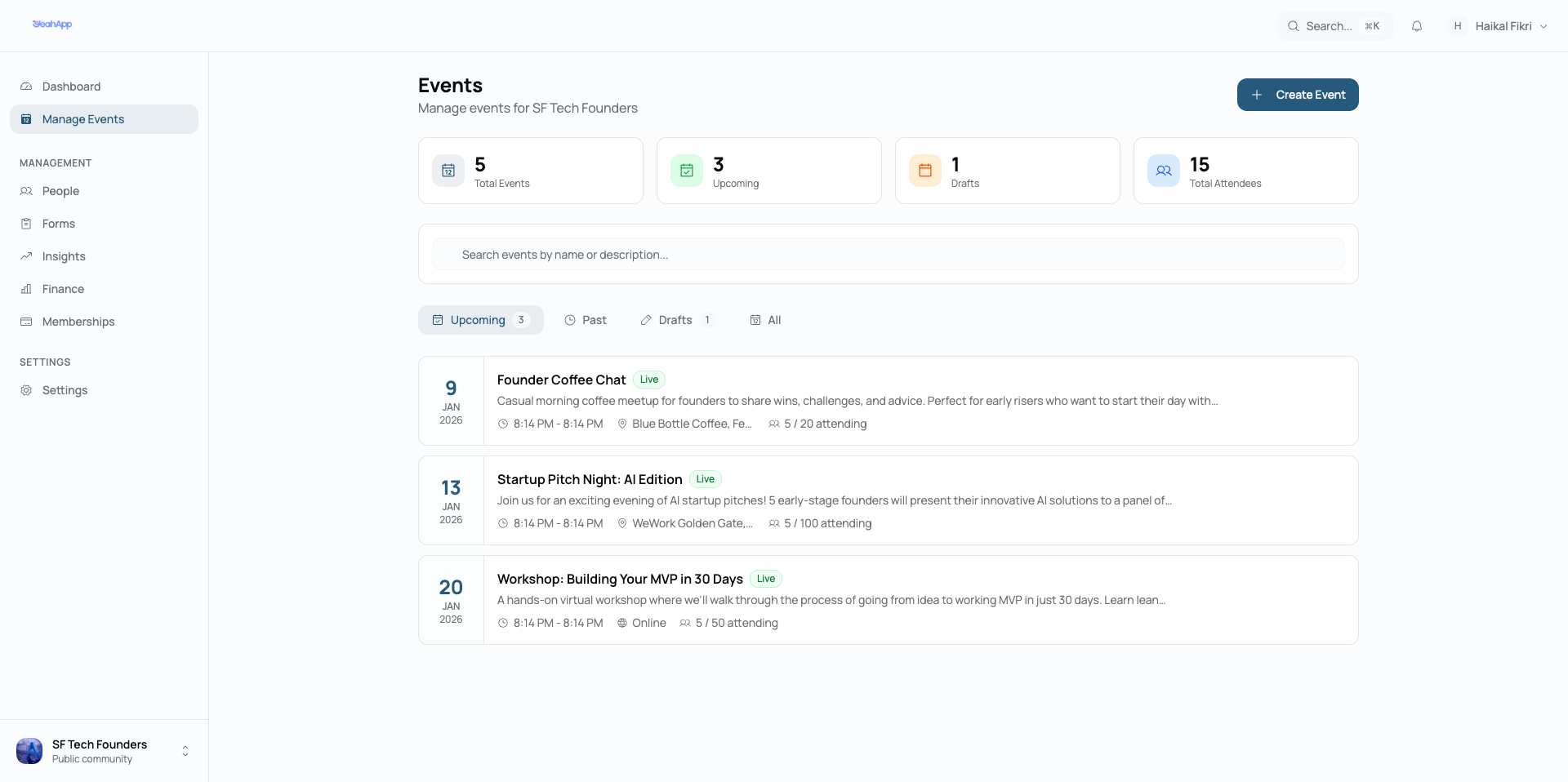
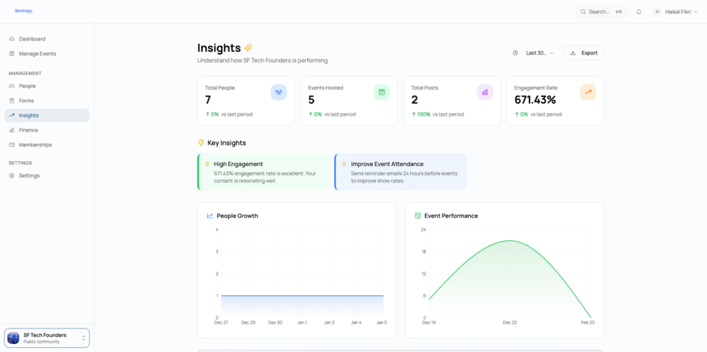
The Community & Events Management Platform
This was the focus of the build. Community builders are our target audience, therefore, we needed to design community and events management features and functionalities that worked flawlessly. We took a behaviour and process oriented approach when designing and developing this platform, taking inspiration from enterprise resource management systems.
